1. Overview
Take-home Exercise #1: To reveal the demographic of the city of Engagement, Ohio USA.
1.1 The Task
In this exercise, we are going to reveal the demographic of the city of Engagement, Ohio USA by using appropriate static statistical graphics methods. The data should be processed by using appropriate tidyverse family of packages and the statistical graphics should be prepared using ggplot2 and its extensions.
2. Getting started
2.1 Installing and loading the required libraries
Before we get started, it is important for us to ensure that the required R packages have been installed. For the purpose of the exercise, the tidyverse packages will be mainly used.
The code chunk below is used to check if the necessary R packages are installed in R. If they have yet, then RStudio will install the missing R package(s). If are already been installed, then they will be loaded in R environment.
packages = c('tidyverse', 'ggdist', 'gghalves', 'ggridges', 'readxl', 'knitr', 'ggrepel', 'rmarkdown', 'plotly')
for(p in packages){
  if(!require(p, character.only = T)){
    install.packages(p)
  }
  library(p, character.only = T)
}
3. Data Import
3.1 Import Participants.csv
In this exercise, Participants.csv csv data file in the Attributes folder will be used.
The code chunk below imports Participants.csv into R environment by using read_csv() function.
participants_data <- read_csv("data/Participants.csv")

paged_table(participants_data)
4. Data Wrangling
4.1 Compute the frequency count of participants & Sort the data
Next, we are going to compute the frequency count of participants by household size, education level and whether having kids. There are two ways to complete the task. The first way is by using the group-by method and the second way is by using the count method of dplyr.
The group-by method
In the code chunk below, group_by() of dplyr package is used
to group the participants by household size, education level and whether
having kids Then, summarise() of dplyr is used to count
(i.e. n()) the number of participants.
Before we can compute the cumulative frequency, we need to sort the
values. To accomplish this task, the arrange()of
dplyr package is used to sort by descending order.
#Frequency count by household size and sort
freq_household <- participants_data %>%
  group_by(`householdSize`) %>%
  summarise('participants' = n()) %>%
  ungroup()%>%
  arrange(desc(participants))
paged_table(freq_household)
#Frequency count by education level and sort
freq_education <- participants_data %>%
  group_by(`educationLevel`) %>%
  summarise('participants' = n()) %>%
  ungroup()%>%
  arrange(desc(participants))
paged_table(freq_education)
#Frequency count by whether having kids in the household and sort
freq_kids <- participants_data %>%
  group_by(`haveKids`) %>%
  summarise('participants' = n()) %>%
  ungroup()%>%
  arrange(desc(participants))
paged_table(freq_kids)
The count method
The code chunk below shows the alternative way to derive the frequency of participants by household size, education level and whether having kids. In this case, count() of dplyr package is used.
arrange() is also used to sort frequency values by descending order.
#Frequency count by household size and sort
freq_household <- participants_data %>%
  count(`householdSize`) %>%
  rename(participants = n)%>%
  arrange(desc(participants))
paged_table(freq_household)
#Frequency count by education level and sort
freq_education <- participants_data %>%
  count(`educationLevel`) %>%
  rename(participants = n)%>%
  arrange(desc(participants))
paged_table(freq_education)
#Frequency count by whether having kids in the household and sort
freq_kids <- participants_data %>%
  count(`haveKids`) %>%
  rename(participants = n)%>%
  arrange(desc(participants))
paged_table(freq_kids)
4.2 Convert age values to age groups
Next we are going to convert the age values into age groups of “25 and below”, “26-35”, “36-45”, “46-55” and “56 and over” and store the data with new column ageGroup in a new dataframe.
participants_data_ag <- participants_data %>%
  mutate(ageGroup = case_when(
    age <=25 ~ "25 and below",
    age > 25 & age <=35 ~ "26-35",
    age > 35 & age <=45 ~ "36-45",
    age > 45 & age <=55 ~ "46-55",
    age > 55 ~ "56 and over")) %>%
  select(-age)

head(participants_data_ag)
# A tibble: 6 x 7
  participantId householdSize haveKids educationLevel    interestGroup
          <dbl>         <dbl> <lgl>    <chr>             <chr>
1             0             3 TRUE     HighSchoolOrColl~ H
2             1             3 TRUE     HighSchoolOrColl~ B
3             2             3 TRUE     HighSchoolOrColl~ A
4             3             3 TRUE     HighSchoolOrColl~ I
5             4             3 TRUE     Bachelors         H
6             5             3 TRUE     HighSchoolOrColl~ D
# ... with 2 more variables: joviality <dbl>, ageGroup <chr>
Similarly to previous steps, we would like to know the frequency count of participants by age group.
#Frequency count by age group and sort
freq_agegroup <- participants_data_ag %>%
  group_by(`ageGroup`) %>%
  summarise('participants' = n()) %>%
  ungroup()%>%
  arrange(desc(participants))
paged_table(freq_agegroup)
4.3 Compute the cumulative frequency
Our next task is to compute the cumulative frequency of participants by age groups. This task will be performed by using mutate() of dplyr package and cumsum() of Base R. The cumulative frequency is then divided by the sum of participants to obtain the cumulative percentage.
freq_cum_ag <- freq_agegroup %>%
  mutate(cumfreq = cumsum(participants)/sum(participants)*100)

paged_table(freq_cum_ag)
freq_cum_hs <- freq_household %>%
  mutate(cumfreq = cumsum(participants)/sum(participants)*100)

paged_table(freq_cum_hs)
freq_cum_ed <- freq_education %>%
  mutate(cumfreq = cumsum(participants)/sum(participants)*100)

paged_table(freq_cum_ed)
freq_cum_kids <- freq_kids %>%
  mutate(cumfreq = cumsum(participants)/sum(participants)*100)

paged_table(freq_cum_kids)
5. Data Visualization
5.1 Create the Pareto Chart
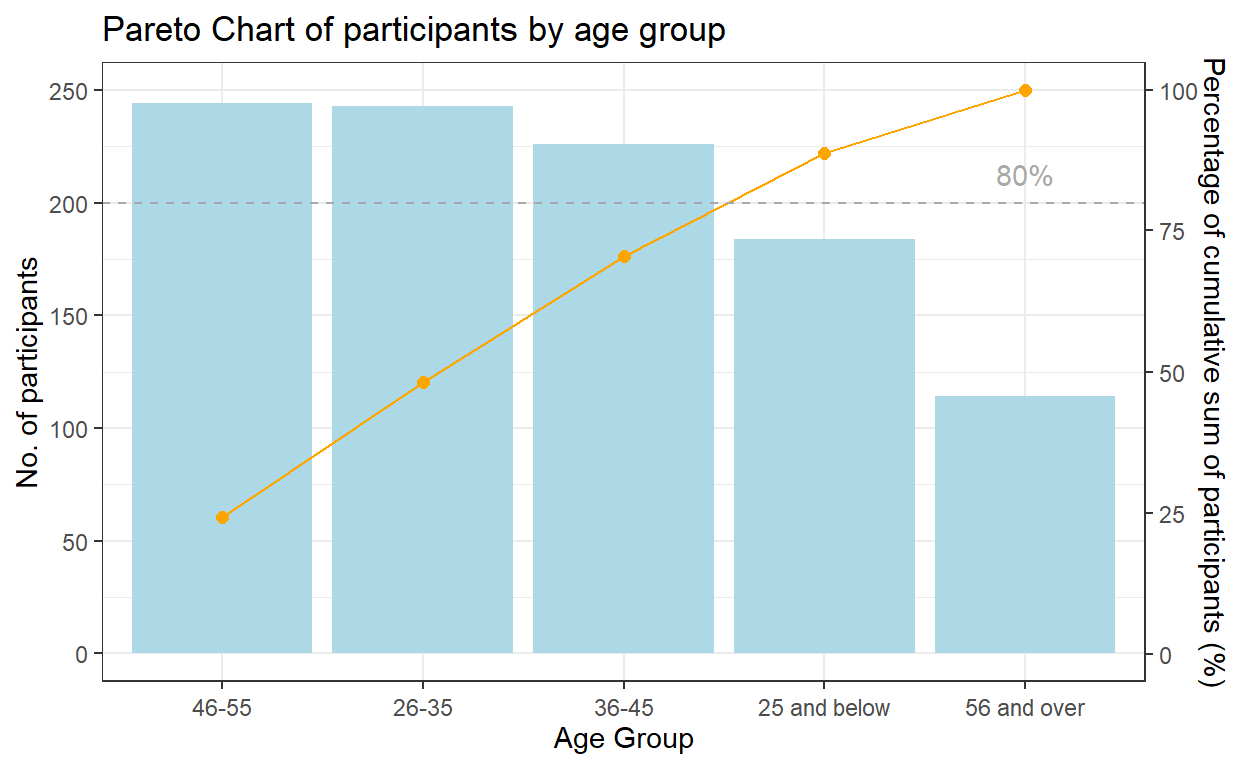
A pareto chart was plotted using ggplot2 as follows for participants by age group:
geom_col() instead of geom_bar() was used to create the bar chart as we do not need to modify the data, and want the height of the bar to represent the actual counts of participants.
geom_line() and geom_point() was used to add the points to represent the cumulative frequency and to connect the points with a line.
scale_y_continuous() was used to adjust the interval between the grid lines and add a secondary y axes for the cumulative percentage of participants. After some trial and error, a coefficient of 0.4 is selected i.e. primary y-axis is multiplied by 0.4 to get the secondary y axis. The corresponding values of the cumulative frequency also needs to be transformed using the coefficient.
geom_hline() was used to add a reference line representing 80% to show which are the age groups that contribute 80% of the participants.
theme() was lastly used to adjust the labels on the x-axis.
coeff <- 0.4
g1 <- ggplot(data=freq_cum_ag,
        aes(x = reorder(`ageGroup`, -participants), y = participants)) +
        geom_col(fill = "light blue") +
        labs(x = "Age Group", title = "Pareto Chart of participants by age group") +
        geom_point(aes(y = `cumfreq`/coeff), colour = 'orange', size = 2) +
        geom_line(aes(y = `cumfreq`/coeff), colour = 'orange', group = 1) +
        geom_hline(yintercept = 80/coeff, colour = 'dark grey', linetype = 'dashed') +
        scale_y_continuous(name =  "No. of participants", breaks = seq(0, 1000, 50),
        sec.axis = sec_axis(~.*coeff, name = "Percentage of cumulative sum of participants (%)")) +
        theme_bw()+
        theme(axis.text.x = element_text(vjust = 0.5)) +
        annotate("text", x='56 and over', y = 85/coeff, label = "80%", colour = "dark grey")
g1
By performing the similar steps, another pareto chart was plotted for participants by education level.
coeff <- 0.2
g2 <- ggplot(data=freq_cum_ed,
        aes(x = reorder(`educationLevel`, -participants), y = participants)) +
        geom_col(fill = "light blue") +
        labs(x = "Education Level", title = "Pareto Chart of participants by education level") +
        geom_point(aes(y = `cumfreq`/coeff), colour = 'orange', size = 2) +
        geom_line(aes(y = `cumfreq`/coeff), colour = 'orange', group = 1) +
        geom_hline(yintercept = 80/coeff, colour = 'dark grey', linetype = 'dashed') +
        scale_y_continuous(name =  "No. of participants", breaks = seq(0, 1000, 50),
        sec.axis = sec_axis(~.*coeff, name = "Percentage of cumulative sum of participants (%)")) +
        theme_bw()+
        theme(axis.text.x = element_text(vjust = 0.5)) +
        annotate("text", x='Low', y = 85/coeff, label = "80%", colour = "dark grey")
g2
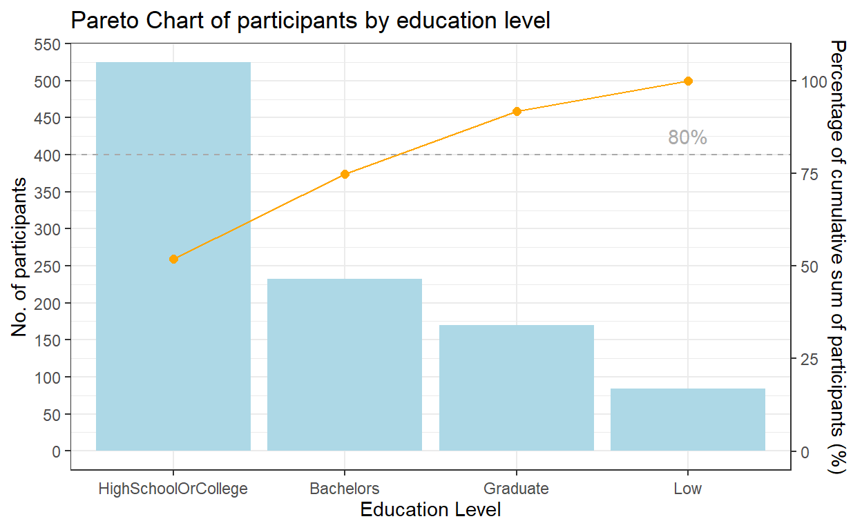
Insights from visualization
From the pareto chart, we can tell that age group distribution is relatively even across most of the age groups, except for senior residents. The no. of participants >56-year old is much smaller than the other groups. We have also noticed that there’re no participants aged <18 or >60.
In terms of education level, half (51.9%) of the participants were graduated from high school or college.
5.2 Create the Household Distribution Pyramid
For the household distribution pyramid, we would like to show the distribution of household size by participant’s age group and whether they have kids.
So we need the household size values of one group of participants (i.e. have kids) to appear on the left side of the chart, and the other (i.e. no kids) to go on the right. To achieve this, the household size values need to be transformed to negative values for participants with kids. mutate() function of dplyr package is used to transform to negative value.
Next, we bind the new dataset containing negative values with the original dataset using rbind() function in Base R.
participants_data_ag_haveKids <- participants_data_ag %>%
  filter(`haveKids` ==  TRUE) %>%
  mutate (householdSize = -householdSize)


participants_data_ag_noKids <-participants_data_ag %>%
  filter(`haveKids` ==  FALSE)

participants_data_ag_byKids <- rbind(participants_data_ag_haveKids, participants_data_ag_noKids)
geom_bar() of ggplot2 is used to plot the bar chart, and coord_flip() is used to flip the x and y axis to form the pyramid.
The scale of the x axis is also required to reformat to positive values on the left side. seq() in Base R is used to sequence the axis with each interval having a length of 500, and the labels of the x-axis to range from 0 to 250 on both sides.
The final chart after formatting is shown below.
ggplot(participants_data_ag_byKids, aes (x = ageGroup, y = householdSize , fill = haveKids)) +
  geom_bar(stat = "identity") +
  coord_flip()+
  scale_y_continuous(breaks = seq(-250, 250, 50),
                     labels = paste0(as.character(c(seq(250, 0, -50), seq(50, 250, 50)))),
                     name = "Household Size")+
  labs(x = "Age Group", title = "Household size by age groups and whether have kids")+
  theme_bw()
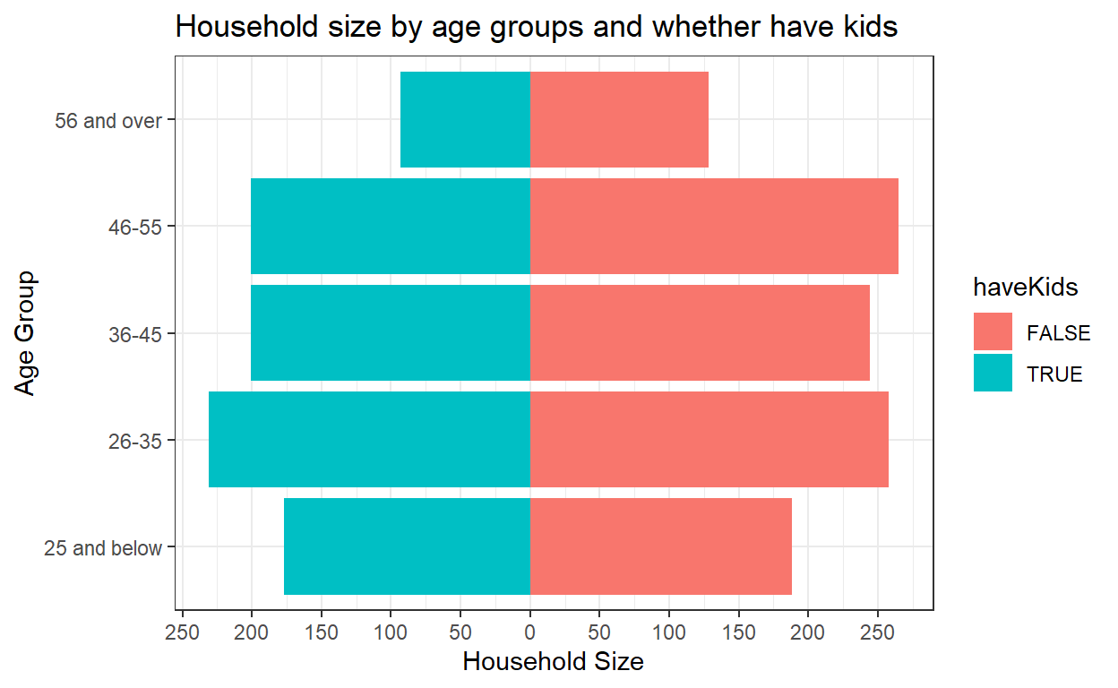
Insights from visualization
From the bar chart, we notice that the total household size for participants with kids is even smaller than the total household size for participants without kids, across all age groups, which could be due to the large proportion (70.2%) of participants having no kids.
5.3 Create Boxplot
geom_boxplot() from ggplot2 is used to create the boxplot. By using geom_point() function, we add in mean value points and adjust the color and size.
facet_grid() function helps to form a matrix of panels. Here we create the boxplot of participant’s joviality by age group in 2 panels of whether the participant has kids.
ggplot(data=participants_data_ag, aes(y = joviality, x= ageGroup)) +
  geom_boxplot() +
  geom_point(stat="summary",
             fun.y="mean",
             colour ="orange",
             size = 2) +
  facet_grid(haveKids ~., labeller = label_both) +
  labs(x = "Age Group", y = "Joviality", title = "Boxplot for joviality by age groups and whether have kids")+
  theme_bw()
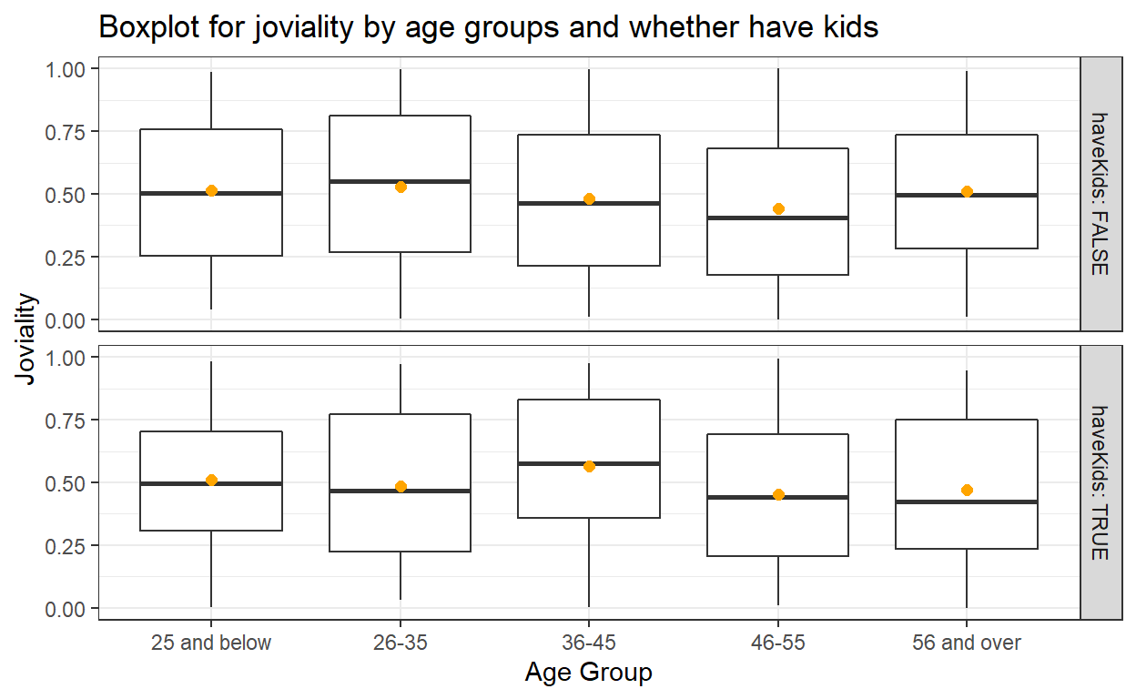
Insights from visualization
From the boxplots, we can tell for participants without kids, age group 26-35 has higher overall happiness level, whereas for participants with kids, age group 36-45 has higher overall happiness level.
5.4 Create split violin plot
Next we are going to use geom_split_violin() of introdataviz package to create split violin plot for joviality of participants by age groups and whether they have kids.
Below code chunk is used to install introdataviz.
devtools::install_github("psyteachr/introdataviz")
Code chunk below is used to create the split violin plot. The plot is also added with boxplot using geom_boxplot() and data points for mean value using stat_summary(). scale_y_continuous() is used to adjust the scale of y-axis.
ggplot(participants_data_ag, aes(x = ageGroup, y = joviality, fill = haveKids)) +
  introdataviz::geom_split_violin(alpha = .4, trim = FALSE) +
  geom_boxplot(width = .2, alpha = .6, fatten = NULL, show.legend = FALSE) +
  stat_summary(fun.data = "mean_se", geom = "pointrange", show.legend = F,
               position = position_dodge(.175)) +
  scale_y_continuous(breaks = seq(0, 1.2, 0.1),
                     limits = c(0, 1.2)) +
  scale_fill_brewer(palette = "Dark2", name = "Have Kids")+
  labs(x = "Age Group", y = "Joviality", title = "Split violin plots for joviality by age groups and whether have kids")+
  theme_bw()
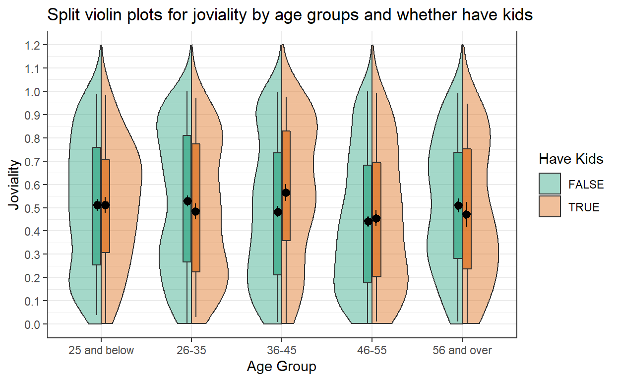
Insights from visualization
From the violin plots, we can see age group 46-55 has relatively lower happiness level as compared to other age groups, regardless whether they have kids or not in the household. Inside age group 36-45, those with kids seem to be happier than those without kids.