1. Overview
Take-home Exercise #2: To critic classmate’s Take-home Exercise 1 submission in terms of clarity and aesthetics, and remake the data visualization design.
1.1 The Task
In this exercise, we are going to remake classmate’s data visualization design of the demographic of the city of Engagement, Ohio USA by using appropriate data visualization principles and best practice. The data should be processed by using appropriate tidyverse family of packages and the statistical graphics should be prepared using ggplot2 and its extensions.
2. Getting Started
2.1 Installing and loading the required libraries
Before we get started, it is important for us to ensure that the required R packages have been installed. For the purpose of the exercise, the tidyverse packages will be mainly used.
The code chunk below is used to check if the necessary R packages are installed in R. If they have yet, then RStudio will install the missing R package(s). If are already been installed, then they will be loaded in R environment.
packages = c('tidyverse', 'ggdist', 'gghalves', 'ggridges', 'readxl', 'knitr', 'ggrepel', 'rmarkdown')
for(p in packages){
  if(!require(p, character.only = T)){
    install.packages(p)
  }
  library(p, character.only = T)
}
3. Data Import
3.1 Import Participants.csv
In this exercise, Participants.csv csv data file in the Attributes folder will be used.
The code chunk below imports Participants.csv into R environment by using read_csv() function.
participants_data <- read_csv("data/Participants.csv")

paged_table(participants_data)
4. Remake Data Visualization Design
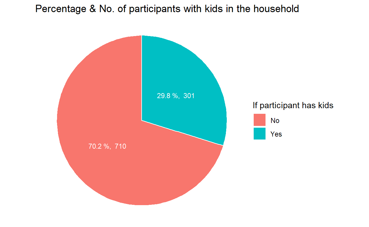
4.1 Count and percentage of participants with or without kids
To show the count of participants with or without kids in the household, a simple bar chart was plotted using geom_bar() in the original design as shown below.
ggplot(data=participants_data, aes(x = haveKids)) +
  geom_bar()
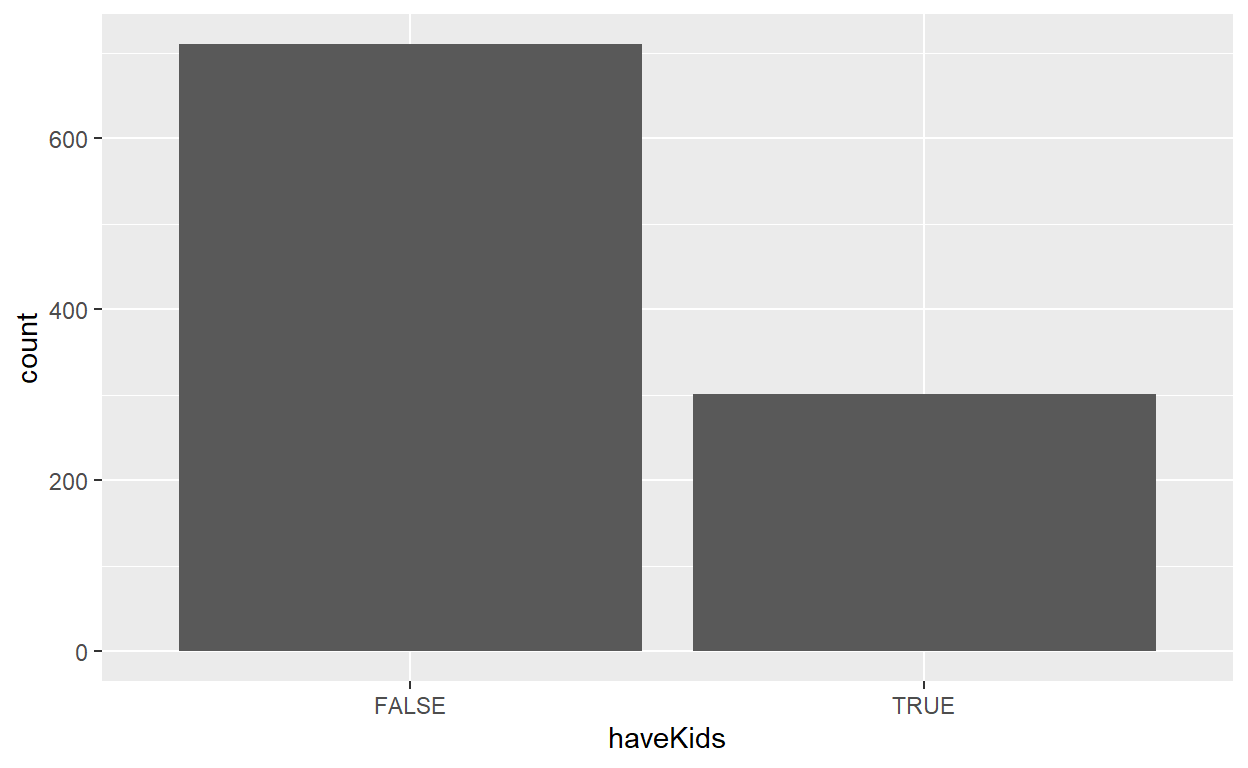
However, the plot does not have clear labeling of the count and percentage of participants on the bars and there’s no proper title of the plot.
To remake the design, first we will perform data wrangling to compute the frequency count of participants by haveKids using the group_by() and summarise() functions of dplyr package.
Since we are only looking at 2 possible values, i.e, have kids or not, it’s clearer to demonstrate the count and percentage of such participants with a pie chart using geom_bar().
geom_text() is used to supplement the text of percentage & count on the pie chart, ggtitle() is used to add overall graph title and scale_fill_discrete() is used to rename the title and label of legends.
#Frequency count by whether having kids in the household and sort
freq_kids <- participants_data %>%
  group_by(`haveKids`) %>%
  summarise('participants' = n()) %>%
  ungroup()%>%
  arrange(desc(participants))

#Pie chart to show Percentage & No. of participants with kids in the household
ggplot(data=freq_kids, aes(x="", y=participants, fill=haveKids)) +
  geom_bar(stat="identity", width=1, color="white") +
  coord_polar("y", start=0) +
  geom_text(aes(label = paste(round(participants / sum(participants) * 100, 1), "%, ", participants), x = 1.0),
            position = position_stack(vjust = 0.5), colour="white", size = 3) +
  ggtitle("Percentage & No. of participants with kids in the household") +
  scale_fill_discrete(name = "If participant has kids", labels = c("No", "Yes")) +
  theme_void()
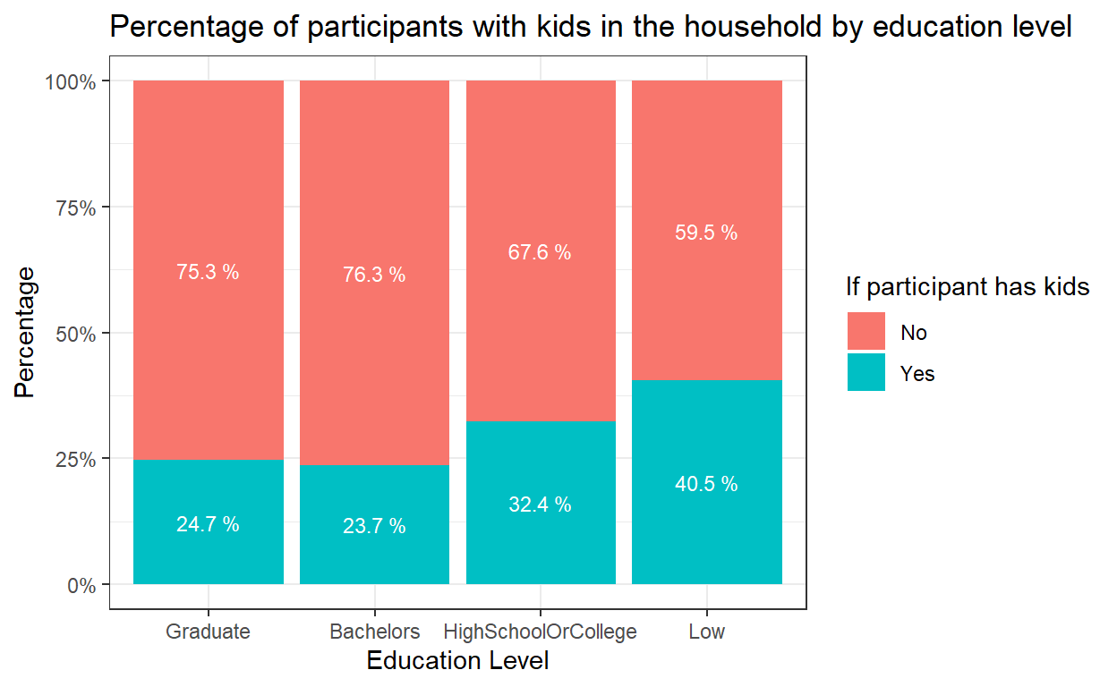
4.2 Compare percentage of participants with or without kids by education level
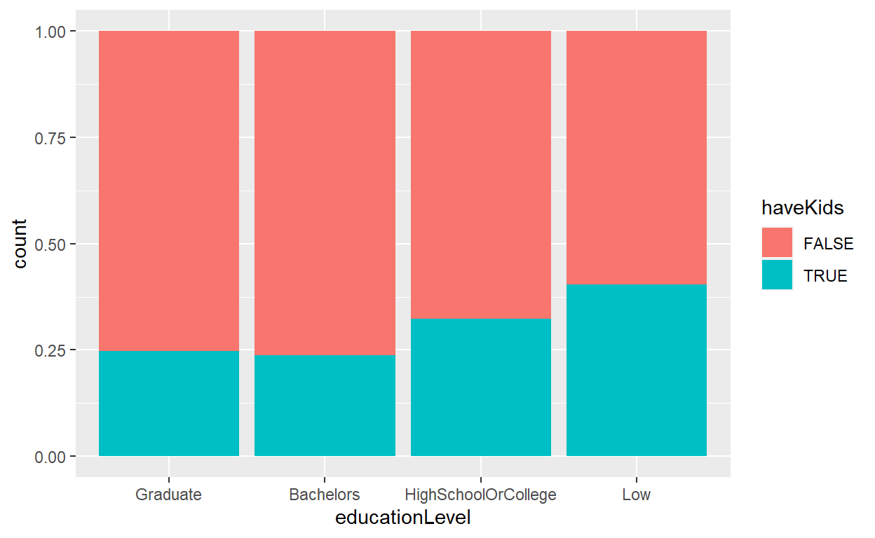
To compare the percentage of participants with kids in each education level, original design was to use geom_bar() to plot a 100% stacked bar chart.
However, the plot did not have correct scale and label in y-axis and no indication of percentage of each components in the stacked bar chart.
participants_data$educationLevel <- factor(participants_data$educationLevel,
                                           levels = c("Graduate", "Bachelors", "HighSchoolOrCollege","Low"))
ggplot(data=participants_data,
       aes(x=educationLevel,fill = haveKids)) +
  geom_bar(position = "fill")
To remake the design, first we need to compute the percentage of participants with/without kids within each education level. We will use count() and group_by() functions followed by mutate() to get the percentage.
#Frequency count and percentage by education level and have kids or not
freq_edu_kids <- participants_data %>%
  count(educationLevel, haveKids) %>%
  group_by(educationLevel) %>%
  mutate(pct= prop.table(n))
  paged_table(freq_edu_kids)
geom_bar() and position=fill is used to create the stacked bar chart. scale_y_continuous() can help to transform the scale of y-axis to percentage. labs() is used to add proper title of both x-axis and y-axis and add overall graph title. Lastly, geom_text() is used to add the labeling of percentage of each component in the stacked bars, and scale_fill_discrete() is used to rename the title and label of legends.
Now it’s clearer to see the trend towards lower fertility rates as residents become more educated.
#Bar chart to show Percentage of participants with kids within each education level
ggplot(data = freq_edu_kids, aes(x = educationLevel, y=pct, fill = haveKids)) +
  geom_bar(stat = "identity", position = "fill") +
  theme(axis.text.x = element_text()) +
  labs(x ="Education Level", y = "Percentage",
       title = "Percentage of participants with kids in the household by education level") +
  scale_y_continuous(labels = scales::percent)+
  scale_fill_discrete(name = "If participant has kids", labels = c("No", "Yes"))+
  theme_bw()+
  geom_text(aes(label = paste(round(pct * 100, 1), "%")),
            position=position_stack(vjust=0.5), colour="white", size = 3)
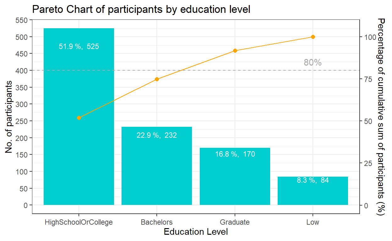
4.3 Participants distribution by education level
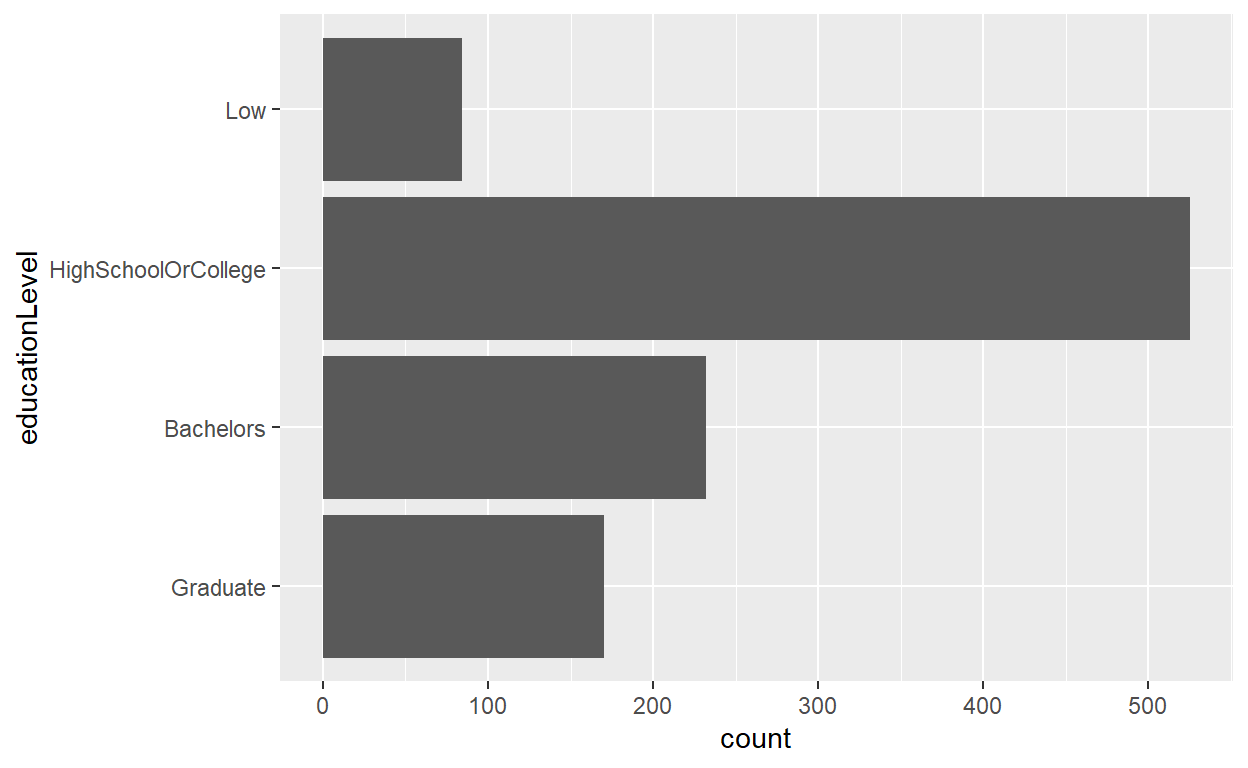
To show the distribution of participants by education level, the original design was to simply create a horizontal bar chart to show the count of participants. It did not have the values e.g. count or percentage on each bar and there’s no proper labeling and sorting.
ggplot(data=participants_data,
       aes(x = educationLevel)) +
  geom_bar() + coord_flip()
The best practice to show such distribution is using pareto chart. First, we need to compute the cumulative frequency of participants by education level and sort by count. This task will be performed by using mutate(), arrange() of dplyr package and cumsum() of Base R. The cumulative frequency is then divided by the sum of participants to obtain the cumulative percentage.
The pareto chart of participants by education level will be plotted using the following functions:
geom_col() instead of geom_bar() was used to create the bar chart as we do not need to modify the data, and want the height of the bar to represent the actual counts of participants.
geom_line() and geom_point() was used to add the points to represent the cumulative frequency and to connect the points with a line.
scale_y_continuous() was used to adjust the interval between the grid lines and add a secondary y axes for the cumulative percentage of participants. After some trial and error, a coefficient of 0.2 is selected i.e. primary y-axis is multiplied by 0.2 to get the secondary y axis. The corresponding values of the cumulative frequency also needs to be transformed using the coefficient.
geom_hline() was used to add a reference line representing 80% to show which are the age groups that contribute 80% of the participants.
theme() was used to adjust the labels on the x-axis. labs() is used to add proper title of both x-axis and y-axis and add overall graph title. Lastly, geom_text() is used to add the labeling of count & percentage for each bar.
coeff <- 0.2
ggplot(data=freq_cum_ed,
       aes(x = reorder(`educationLevel`, -participants), y = participants)) +
  geom_col(fill = "cyan3") +
  labs(x = "Education Level", title = "Pareto Chart of participants by education level") +
  geom_point(aes(y = `cumfreq`/coeff), colour = 'orange', size = 2) +
  geom_line(aes(y = `cumfreq`/coeff), colour = 'orange', group = 1) +
  geom_hline(yintercept = 80/coeff, colour = 'dark grey', linetype = 'dashed') +
  scale_y_continuous(name =  "No. of participants", breaks = seq(0, 1000, 50),
  sec.axis = sec_axis(~.*coeff, name = "Percentage of cumulative sum of participants (%)")) +
  theme_bw()+
  theme(axis.text.x = element_text(vjust = 0.5)) +
  annotate("text", x='Low', y = 85/coeff, label = "80%", colour = "dark grey")+
  geom_text(aes(label = paste(round(participants / sum(participants) * 100, 1), "%, ", participants)),
            position=position_stack(vjust= 0.9), colour="white", size = 3)
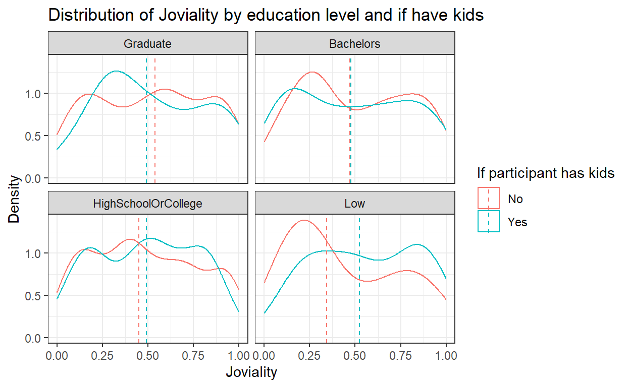
4.4 Joviality distribution by education level and kids
To show the distribution of joviality by education level, the original design was to create a density graph with 2 lines indicating whether the participant has kids and to further wrap the plots of different education levels into one plot together.
This is a good example but certain improvements still can be done including adding in more info such as median or mean and improve the aesthetics with appropriate title and labeling.
ggplot(data=participants_data, aes(x=joviality,colour = haveKids)) +
  geom_density() +
  facet_wrap(~ educationLevel)
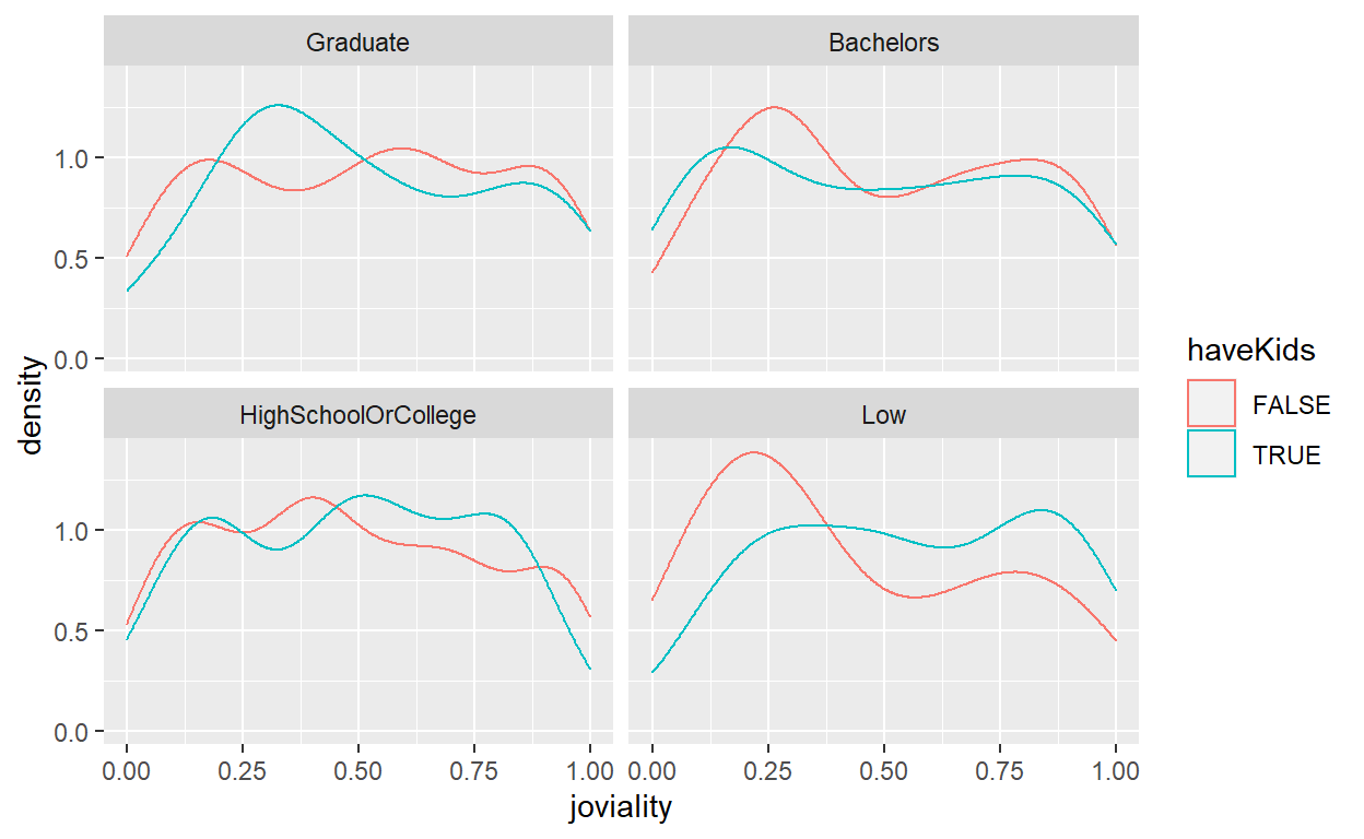
First, let’s compute the mean and median of joviality for each group of education level and if they have kids. group_by() and summarise_at() functions are used to calculate mean/median, followed by rename() of the calculated column.
From the results, we can see the difference across groups in terms of mean of joviality is not obvious as compared to median of joviality, so we will use median value in subsequent plots.
mean_joviality<- participants_data %>%
   group_by(educationLevel, haveKids) %>%
   summarise_at(vars("joviality"), mean) %>%
   rename(joviality_mean = joviality)
head(mean_joviality)
# A tibble: 6 x 3
# Groups:   educationLevel [3]
  educationLevel      haveKids joviality_mean
  <fct>               <lgl>             <dbl>
1 Graduate            FALSE             0.515
2 Graduate            TRUE              0.520
3 Bachelors           FALSE             0.501
4 Bachelors           TRUE              0.486
5 HighSchoolOrCollege FALSE             0.485
6 HighSchoolOrCollege TRUE 0.488median_joviality<- participants_data %>%
group_by(educationLevel, haveKids) %>%
summarise_at(vars("joviality"), median) %>%
rename(joviality_median = joviality)
head(median_joviality)
# A tibble: 6 x 3
# Groups:   educationLevel [3]
  educationLevel      haveKids joviality_median
  <fct>               <lgl>               <dbl>
1 Graduate            FALSE               0.539
2 Graduate            TRUE                0.491
3 Bachelors           FALSE               0.471
4 Bachelors           TRUE                0.478
5 HighSchoolOrCollege FALSE               0.451
6 HighSchoolOrCollege TRUE                0.492
To enhance the original design, we will add in the vertical line for median value using geom_vline().
labs() is used to add proper title of both x-axis and y-axis and add overall graph title, and scale_colour_discrete() is used to rename the title and label of legends.
ggplot(data=participants_data, aes(x=joviality, color = haveKids)) +
  geom_density() +
  geom_vline(data=median_joviality, aes(xintercept=joviality_median, color=haveKids),
             linetype="dashed")+
  labs(x ="Joviality", y = "Density",
       title = "Distribution of Joviality by education level and if have kids") +
  theme_bw()+
  facet_wrap(~ educationLevel)+
  scale_colour_discrete(name = "If participant has kids", labels = c("No", "Yes"))
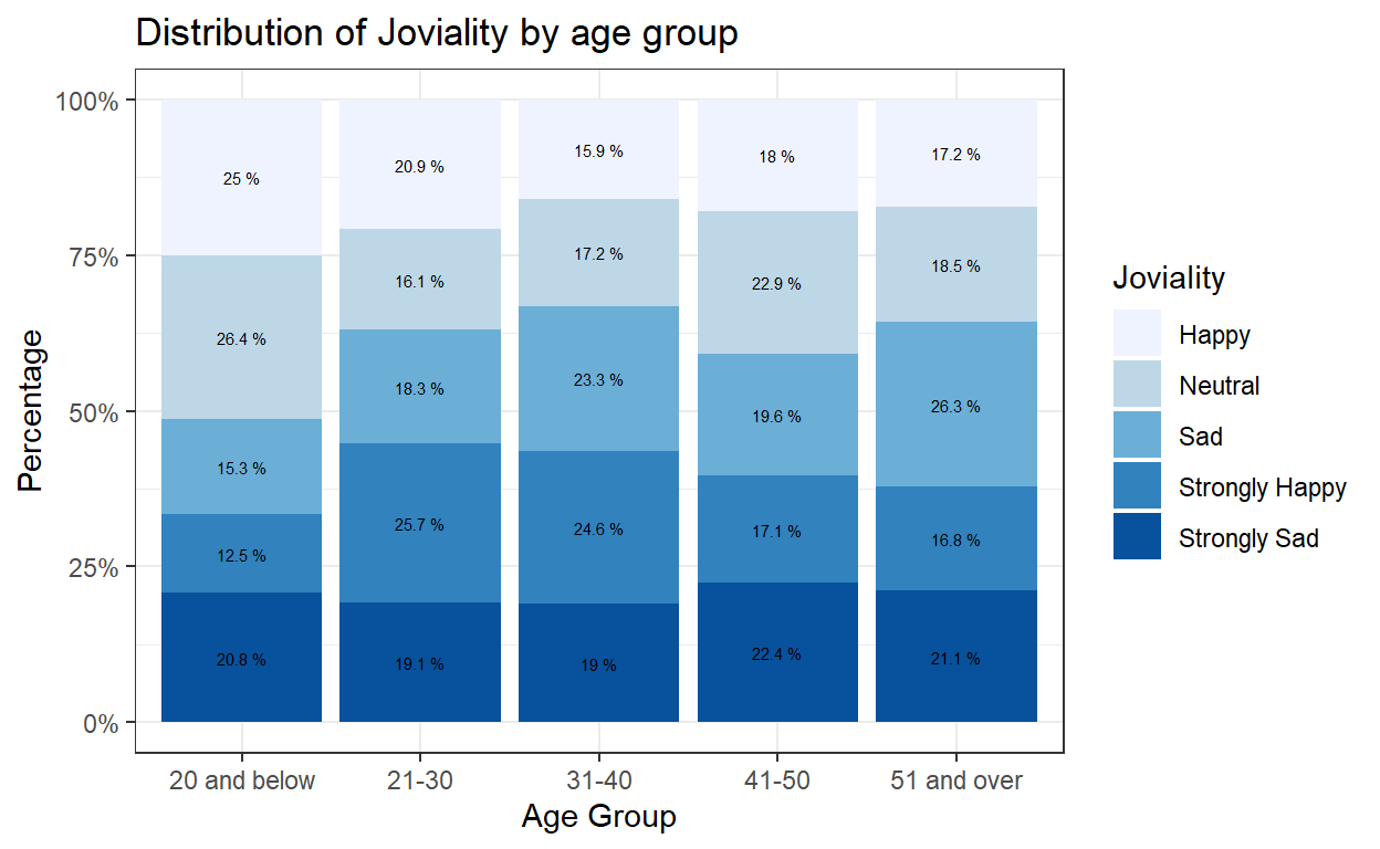
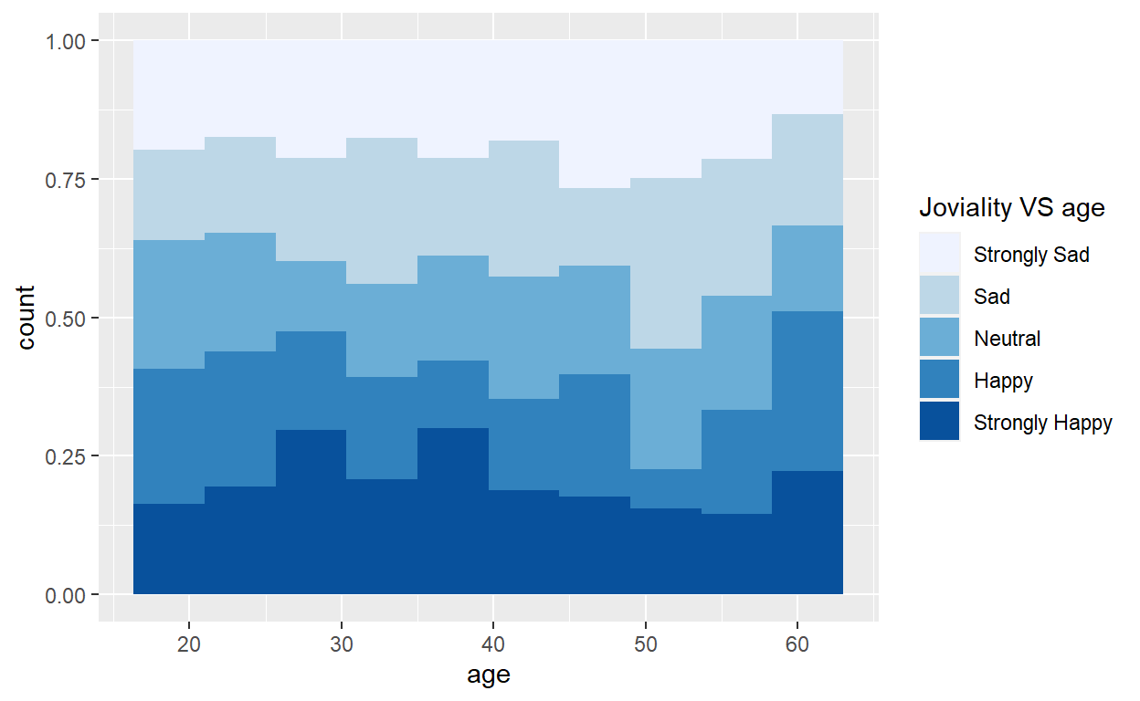
4.5 Joviality distribution by age
The original design was to break down joviality into groups and show the distribution of joviality group versus age in a histogram. Few improvements can be done on top of this good example such as binning of ages into groups as well and adding in appropriate title and labeling.
condition<- cut(participants_data$joviality, breaks = c(0,0.2,0.4,0.6,0.8,1), labels = c("Strongly Sad","Sad","Neutral","Happy","Strongly Happy"))

ggplot(data=participants_data, aes(fill=condition, x=age)) +
    geom_histogram(position="fill", bins=10)+
scale_fill_brewer(palette = "Blues", name = "Joviality VS age")
Below code chunk is used to bin age and joviality into groups using mutate() and case_when() functions. The results will be stored in a new dataframe from which the frequency count and percentage will be further calculated.
participants_data_ag <- participants_data %>%
  mutate(ageGroup = case_when(
    age <=20 ~ "20 and below",
    age > 20 & age <=30 ~ "21-30",
    age > 30 & age <=40 ~ "31-40",
    age > 40 & age <=50 ~ "41-50",
    age > 50 ~ "51 and over")) %>%
  select(-age)
#head(participants_data_ag)

participants_data_ag_jg <- participants_data_ag %>%
  mutate(jovialityGroup = case_when(
    joviality <=0.2 ~ "Strongly Sad",
    joviality > 0.2 & joviality <=0.4 ~ "Sad",
    joviality > 0.4 & joviality <=0.6 ~ "Neutral",
    joviality > 0.6 & joviality <=0.8 ~ "Happy",
    joviality > 0.8 ~ "Strongly Happy")) %>%
  select(-joviality)
#head(participants_data_ag_jg)

#Frequency count and percentage by age group and joviality group
freq_age_jov <- participants_data_ag_jg %>%
  count(ageGroup, jovialityGroup) %>%
  group_by(ageGroup) %>%
  mutate(pct= prop.table(n))
  paged_table(freq_age_jov)
Since the age is now converted into groups, we can use geom_bar() instead of geom_histogram() to create the 100% stacked bar chart. scale_y_continuous() can help to transform the scale of y-axis to percentage. labs() is used to add proper title of both x-axis and y-axis and add overall graph title. Lastly, geom_text() is used to add the labeling of percentage of each component in the stacked bars.
ggplot(data=freq_age_jov, aes(fill=jovialityGroup, x=ageGroup, y=pct)) +
  geom_bar(stat = "identity", position = "fill") +
  labs(x ="Age Group", y = "Percentage",
       title = "Distribution of Joviality by age group") +
  scale_y_continuous(labels = scales::percent)+
  scale_fill_brewer(palette = "Blues", name = "Joviality")+
  theme_bw()+
  geom_text(aes(label = paste(round(pct * 100, 1), "%")),
            position=position_stack(vjust=0.5), colour="black", size = 2)